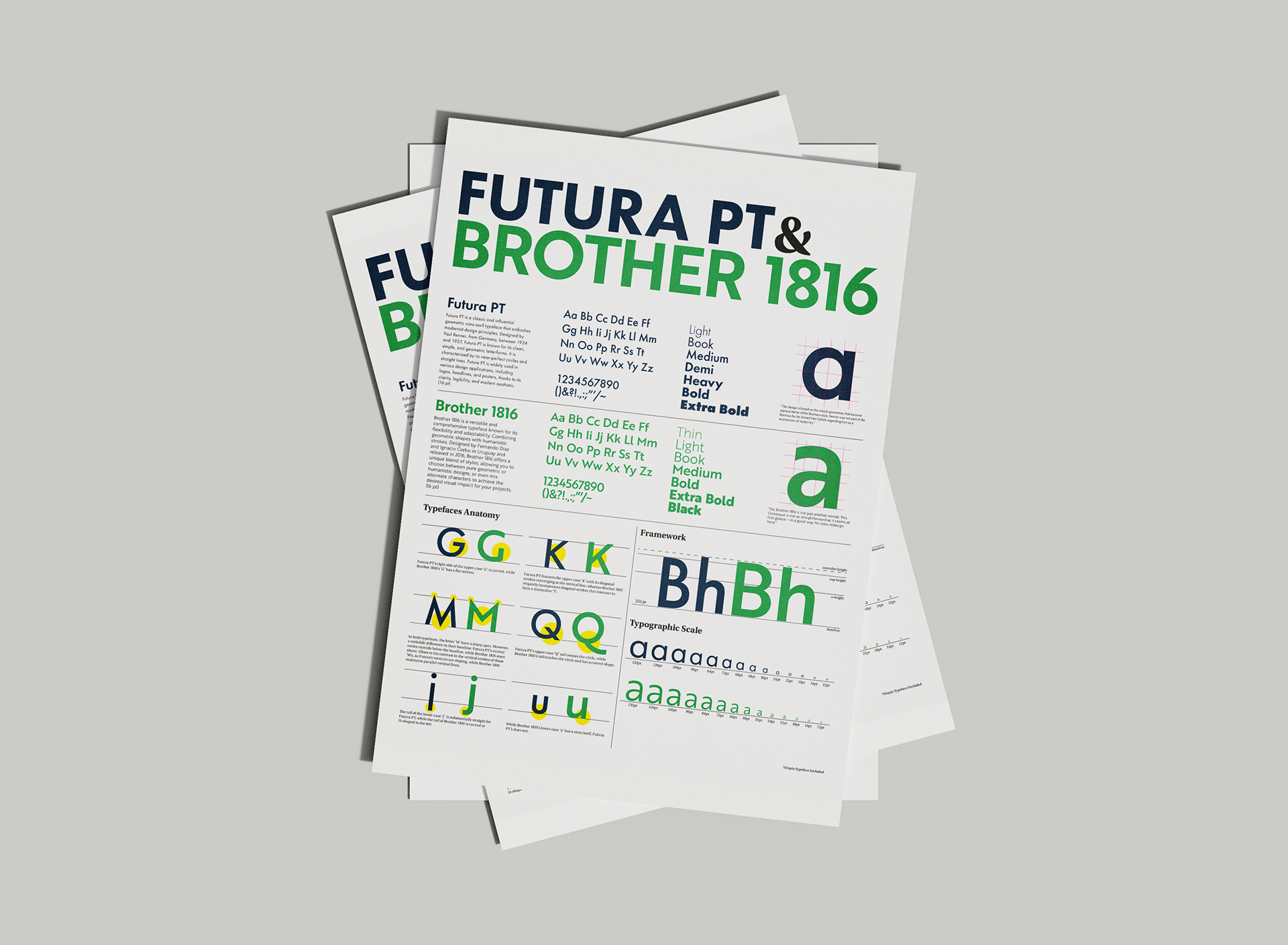
typography II / school work
our goal was to compare two similar typefaces, examining their differences. i chose to compare two of my favorite fonts, pointing out what makes each of them unique. one notable difference i observed was their size: although them being set tho the same pt size, brother 1816 is slightly larger and wider than futura pt, as seen in the framework section and typographic scale.