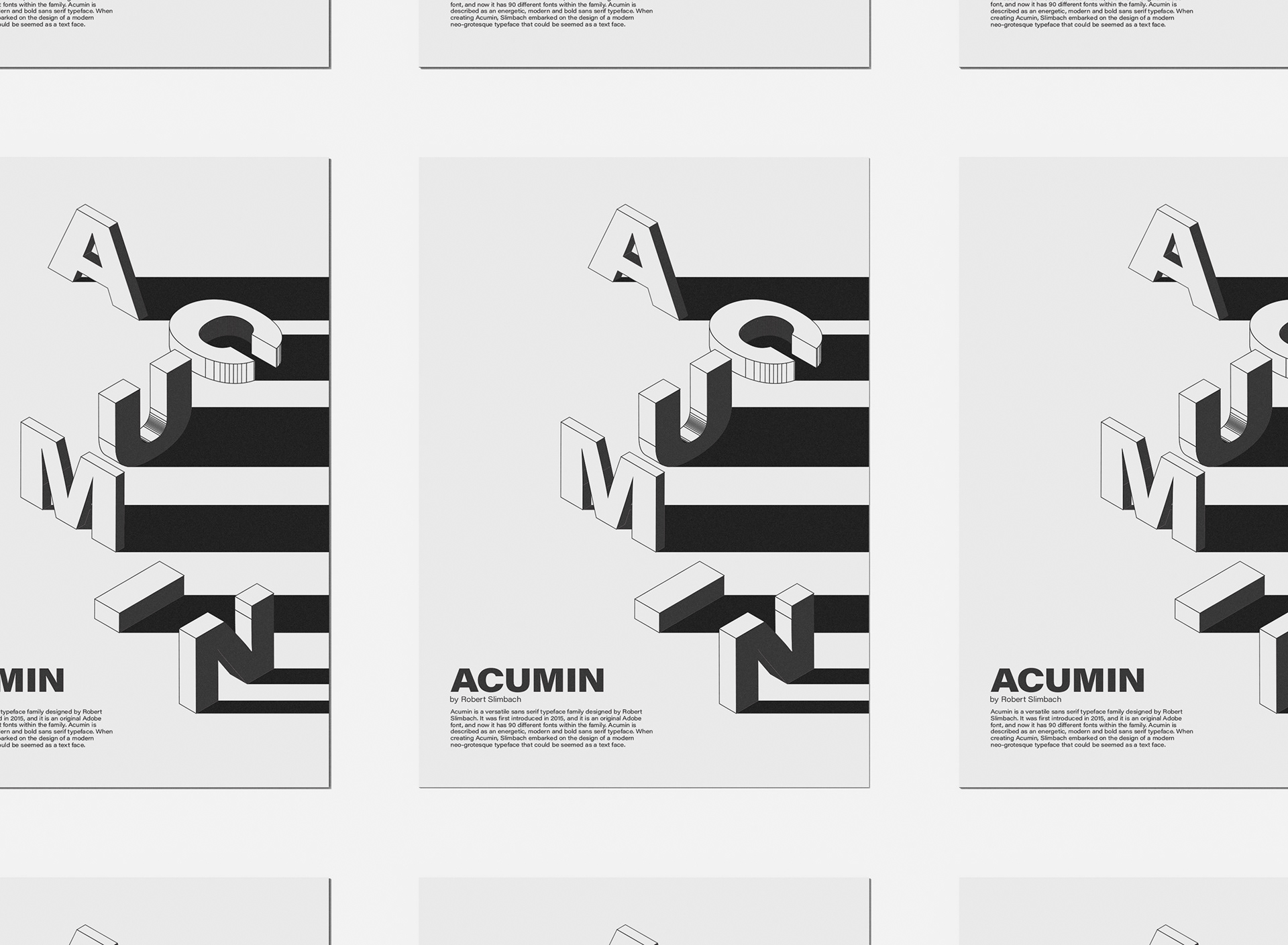
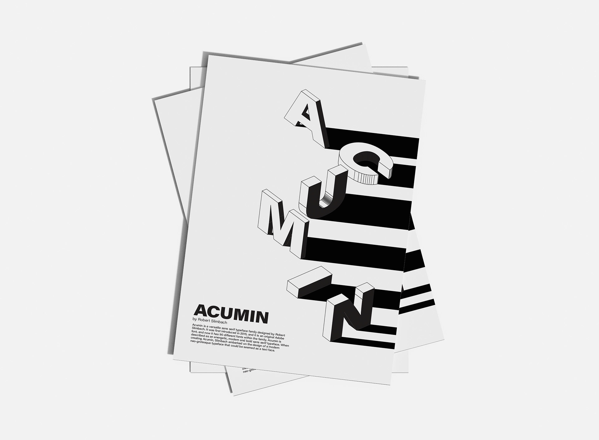
typography I / school work
poster to show off the typeface 'acumin'. i made two variations of this poster with the b&w one being my favorite one. the point of this assignment was to make the typeface interesting to the eye. i chose the 'acumin' typeface because it had many families within the typeface, and that's what i wanted to represent with the red poster.